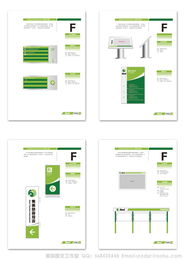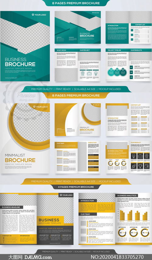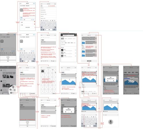
在平面設計與數字媒體領域,讓版面設計看起來真實、自然且富有質感,是提升作品專業度和吸引力的關鍵。無論是海報、網頁、宣傳冊還是社交媒體圖片,一個“真實”的設計能迅速拉近與觀眾的距離,建立信任感。本文將通過中英文對照的圖文教程,系統性地介紹實現逼真版面設計的核心原則與實操技巧。
一、核心原則:理解“真實感”的源泉
1. 層次與深度 (Hierarchy & Depth)
* 中文:避免版面過于平坦。通過大小、顏色、明暗對比建立清晰的視覺層次,讓重要信息突出。運用微妙的陰影、漸變或疊加效果,為元素創造縱深感。
- English: Avoid flat layouts. Establish a clear visual hierarchy through size, color, and contrast to make key information stand out. Use subtle shadows, gradients, or overlay effects to create a sense of depth for elements.
- 圖解:展示同一組信息在無層次設計和有層次設計下的對比圖。
2. 質感與紋理 (Texture & Grain)
* 中文:純色塊容易顯得數碼化和冰冷。適當添加紙張紋理、布紋、微妙的噪點或劃痕,可以瞬間增加設計的觸感和年代感,使其更像物理世界存在的物件。
- English: Solid color blocks can appear too digital and cold. Appropriately adding paper textures, fabric patterns, subtle noise, or scratches can instantly enhance the tactile feel and vintage sense of a design, making it resemble an object in the physical world.
- 圖解:展示光滑背景與添加了細微紙質紋理背景的對比。
3. 一致的光影邏輯 (Consistent Lighting)
* 中文:確定一個統一的光源方向。所有元素的陰影、高光都應遵循此邏輯。不一致的光影是設計顯得“假”的主要原因之一。
- English: Define a unified light source direction. Shadows and highlights on all elements should follow this logic. Inconsistent lighting is a primary reason why designs look "fake."
- 圖解:用箭頭標明光源,展示按鈕、圖標等元素如何根據同一光源產生陰影。
4. 留白與呼吸感 (White Space & Breathing Room)
* 中文:擁擠的版面會讓人感到壓抑和不真實。合理的留白(未必是白色)能引導視覺焦點,讓內容“呼吸”,提升高級感和可讀性。
- English: Crowded layouts can feel oppressive and unnatural. Reasonable white space (not necessarily white) guides the visual focus, allows content to "breathe," and enhances a sense of premium quality and readability.
- 圖解:對比信息密集的排版與經過留白處理的清爽排版。
二、圖文設計制作實戰教程
案例:制作一張逼真的產品推廣社交媒體圖片
步驟 1: 搭建基礎框架與網格 (Set Up Framework & Grid)
* 中文:在設計軟件(如Photoshop, Figma, Canva)中創建畫布。使用網格或參考線對齊元素,確保版面結構嚴謹。
- English: Create a canvas in your design software (e.g., Photoshop, Figma, Canva). Use grids or guides to align elements, ensuring a rigorous layout structure.
步驟 2: 融入背景質感 (Incorporate Background Texture)
* 中文:導入一張淺色的紙質紋理圖片,設置為背景,將混合模式改為“疊加”或“柔光”,并降低不透明度至10%-20%。
- English: Import a light-colored paper texture image, set it as the background, change the blending mode to "Overlay" or "Soft Light," and reduce opacity to 10%-20%.
步驟 3: 處理主體元素(文字/圖片)(Handle Main Elements: Text/Images)
* 中文:
- 文字:選擇易讀的字體。關鍵標題可添加微妙的內陰影或漸變,并設置一個柔和投影(距離小,擴展度低,大小適中)。
- 圖片:對產品圖片進行摳圖,邊緣可稍加羽化。在圖片底部添加一個長陰影或與背景色融合的漸變。
- English:
- Text: Choose a legible font. For key titles, add subtle Inner Shadow or Gradient, and set a soft Drop Shadow (small distance, low spread, moderate size).
- Images: Remove the background from product images, with edges slightly feathered. Add a long shadow or a gradient that blends with the background color at the bottom of the image.
步驟 4: 添加裝飾與細節 (Add Decorations & Details)
* 中文:放置一些線條、幾何形狀或圖標。為這些形狀添加“描邊”或“斜面與浮雕”效果,但強度務必調低。在所有元素最上層,新建一個圖層,填充雜色濾鏡(單色,約2-3%),模擬真實印刷品的微顆粒感。
- English: Place some lines, geometric shapes, or icons. Add "Stroke" or "Bevel & Emboss" effects to these shapes, but keep the intensity very low. On top of all layers, create a new layer, fill it with a noise filter (monochromatic, about 2-3%) to simulate the fine grain of real printed material.
步驟 5: 最終檢查與輸出 (Final Check & Export)
* 中文:檢查光影是否統一,層次是否清晰,紋理是否自然不喧賓奪主。確認中英文排版正確無誤后,導出為高清PNG或JPEG格式。
- English: Check for consistent lighting, clear hierarchy, and natural textures that don't overpower the main content. Verify that both Chinese and English typography are correct, then export as high-resolution PNG or JPEG.
三、常用中英文設計術語對照
- 陰影 Drop Shadow
- 漸變 Gradient
- 不透明度 Opacity
- 混合模式 Blending Mode
- 紋理 Texture
- 排版 Typography / Typesetting
- 層次 Hierarchy
- 對齊 Alignment
- 畫布 Canvas
- 圖層 Layer
****:真實的版面設計源于對物理世界視覺規律的洞察與數字化模擬。掌握層次、質感、光影和留白這四大支柱,并通過持續練習將細節技巧融入其中,你便能創造出既美觀又令人信服的設計作品。記住,最出色的“真實感”往往是那些不易被察覺,卻無處不在的精心細節。